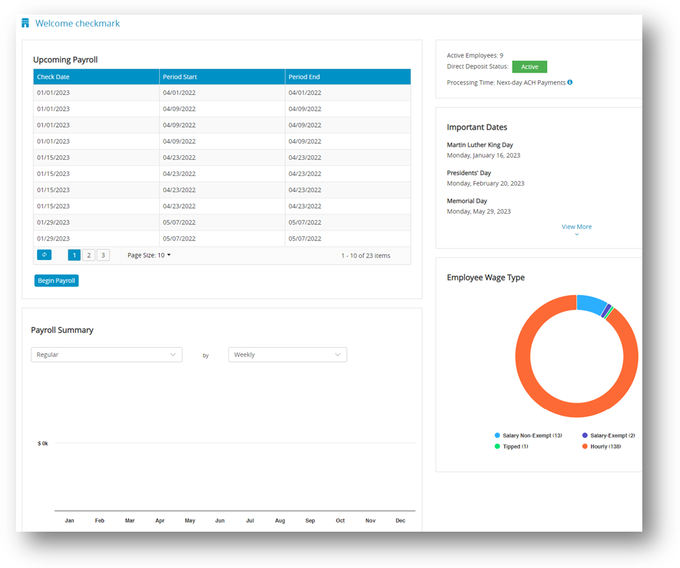
In CheckMark Online Payroll, the Dashboard presents vital information and data in a visual format, bringing them together into a single view. It provides a quick and clear overview of employee count, salary details, important dates, and a summary of the payroll. This dashboard is utilized for real-time monitoring and data analysis, presenting the information in an easily understandable manner through the use of charts, graphs, and other visual elements.
Payroll Summary
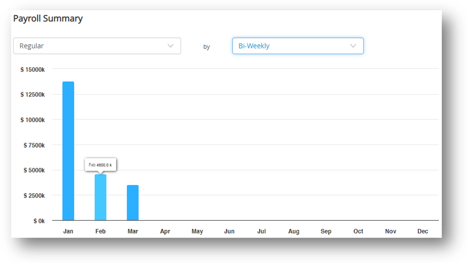
A payroll summary with dropdown options for hour’s categories and pay frequency periods can be enhanced with a column chart visual representation. This chart provides a graphical representation of the data in the summary, making it easier to understand and analyze the information.

Here’s how the payroll summary with a column chart visual representation works:
✓ Hours Categories Dropdown: This dropdown allows you to select different categories of hours, such as regular hours, overtime hours, vacation hours, or sick leave hours. Once you select a specific category, the payroll summary will display the corresponding data related to that category. For example, if you choose “overtime hours,” the summary will show the total number of overtime hours worked by each employee during the selected pay frequency period.
✓ Pay Frequency Period Dropdown: This dropdown enables you to select the time period for which you want to generate the payroll summary. You can choose from options like weekly, bi-weekly, semi-monthly, or monthly. Once you select the desired period, the summary will display the relevant data for that specific timeframe. This includes wages earned, deductions, taxes, and net pay for each employee during the chosen pay frequency period.
The chart visually summarizes the data, making it easier to identify trends and compare values. Each category (e.g., regular hours, overtime hours) is shown as a separate column, with the height indicating total hours worked or compensation earned. This visual representation provides a quick overview and helps identify patterns in the data.
Employee Wage Type
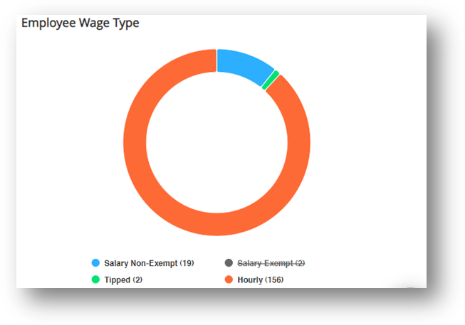
The Employee Wage Type pie chart is a visual representation of the distribution of different employee wages within an online payroll system. By default, it includes filters such as salary non-exempt, salary exempt, tipped, and hourly.

You can interact with the wage type pie chart in two ways: by moving your cursor over the chart segments or by clicking on the options below the chart.
✓ Moving the cursor over the pie chart segments allows you to see the wage type and its corresponding value. This helps you quickly understand the proportion of each wage type compared to the total wages. By hovering over a segment, you can also see additional information like the percentage or monetary amount it represents.
✓ The options below the pie chart provide filters that allow you to focus on specific categories. For example, click on “Salary Non-Exempt” to view wages only for non-exempt employee salary. This allows you to analyze the distribution within that particular employee group. Similarly, you can click on other options like “Salary Exempt,” “Tipped,” or “hourly” to isolate and study wages specific to those categories.

